An improved Field Notes inset
Just the inset, please
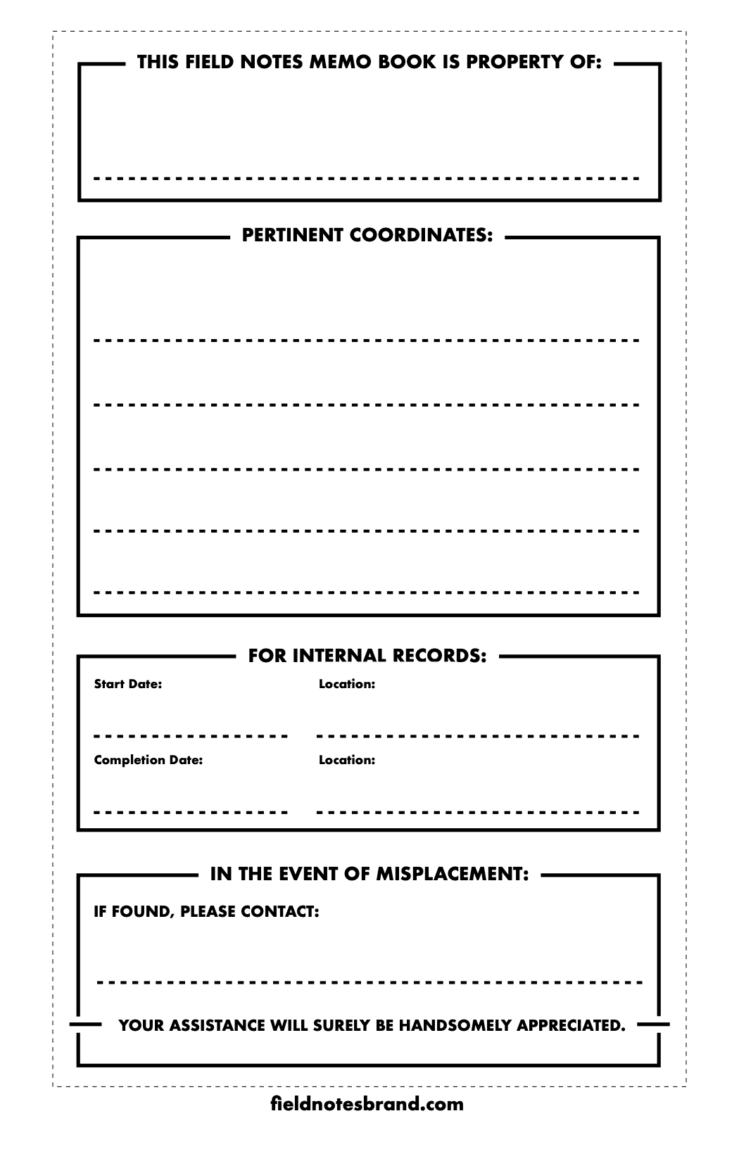
I have redesigned the informational box on the inside cover of the standard 3.5” x 5.5” Field Notes notebook. The PDF is available here. I recommend printing onto a full-page sticker page, from which you can cut four insets.
A description of the problem
I am a big fan of carrying around a pocket notebook, and have been doing so for over a decade. A pocket notebook has many things to recommend it:
- it is a wonderful aid to the memory;
- you can do things on paper that are difficult to do on a computer, even today; and
- in contrast to pulling out one’s phone when in company, it is never rude to pull out a notebook, and in fact is often a compliment.
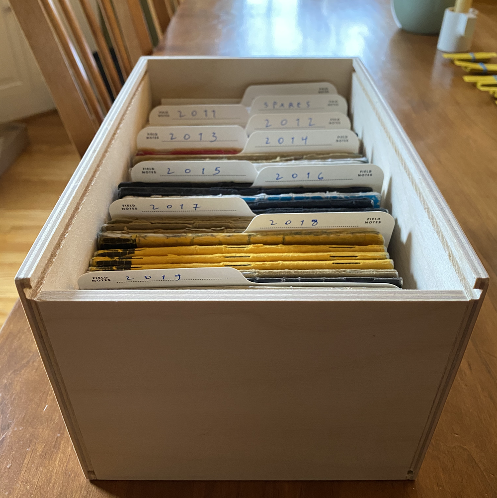
My allegiance is to Field Notes, whose creativity and artistry are evident in their work, which makes it worth paying the small premium over the generic copies you can find on knockoff marketers like Amazon. I bought my first book from them in 2011, almost certainly on a recommendation from Daring Fireball. When I am finished with one, I review it for important information in need of digital organization, and then I file it in my Field Notes Archival Wooden Box.
I have only one complaint. It is about the design of the front inset, which are apparent in this image:
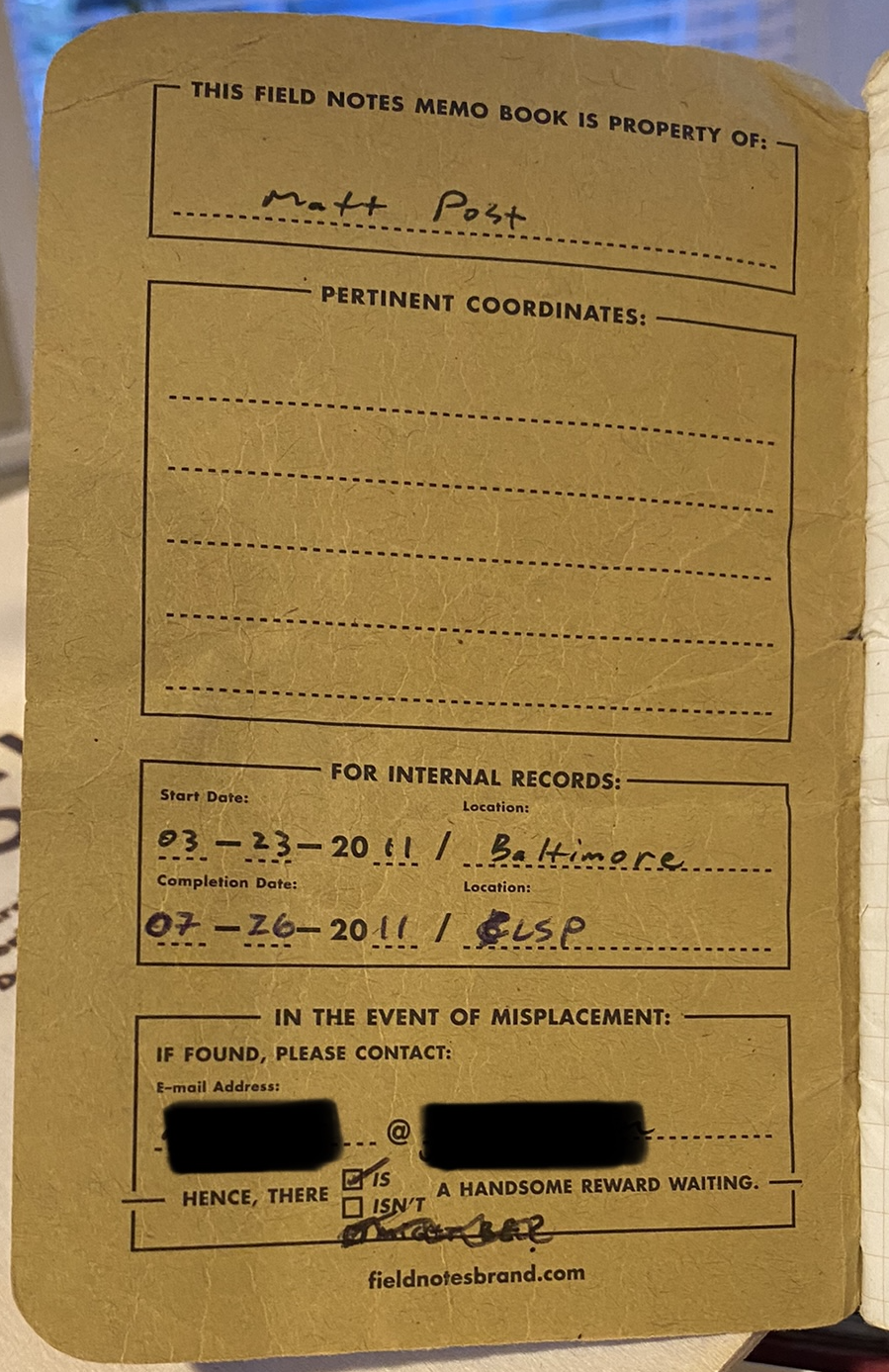
- On dark covers, it is very hard to write on and to read.
- It prescribes the following date format:
__-__-20__. This date format is an impediment to an orderly life. Hyphenated dates should be written in ISO-8601 format, and people should also be free to choose the DD.MM.YYYY European variant. Furthermore, my handwriting clashes with the font they selected for the century. - The contact info box is also overly prescriptive. It presumes you want to be contacted via email (instead of phone or URL), and that the name portion of your address is the same length as the domain.
- The reward checkbox is cumbersome. One cannot reasonably select “ISN’T” and expect assistance from a stranger. Better to leave it vague.
In light of these complaints, I designed my own inset that retains the lovely design but addresses these issues.
You can download a full-page PDF here. It is designed to be printed onto an A4 or letter-sized sticker page and cut out. I owe many thanks to Coudal partners, whose attention to detail extends even to listing the name of the font they used in their design, which was a great assistance in producing this variant.